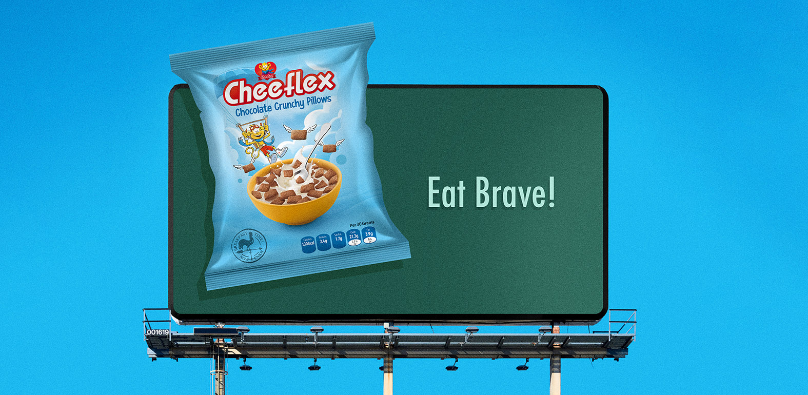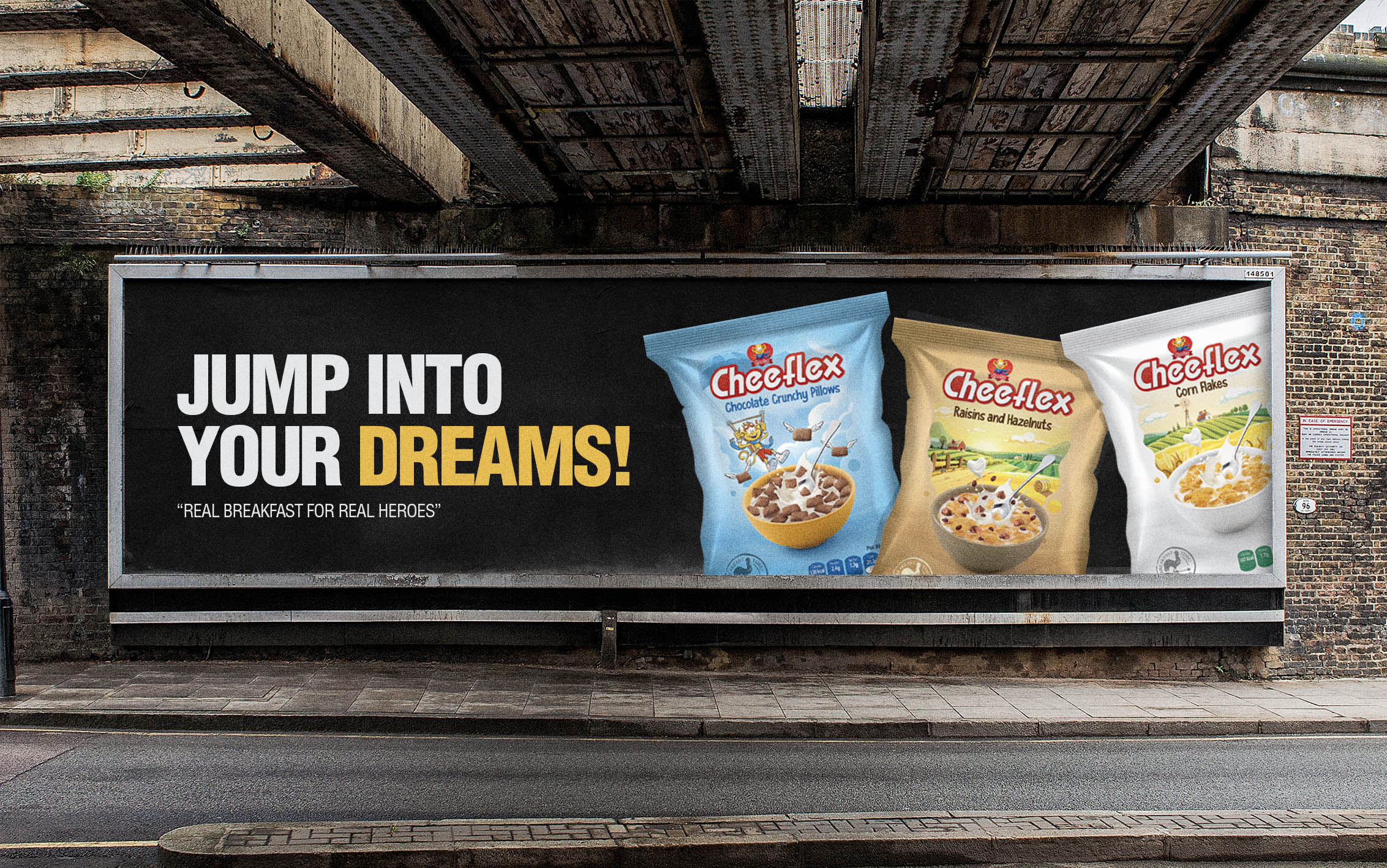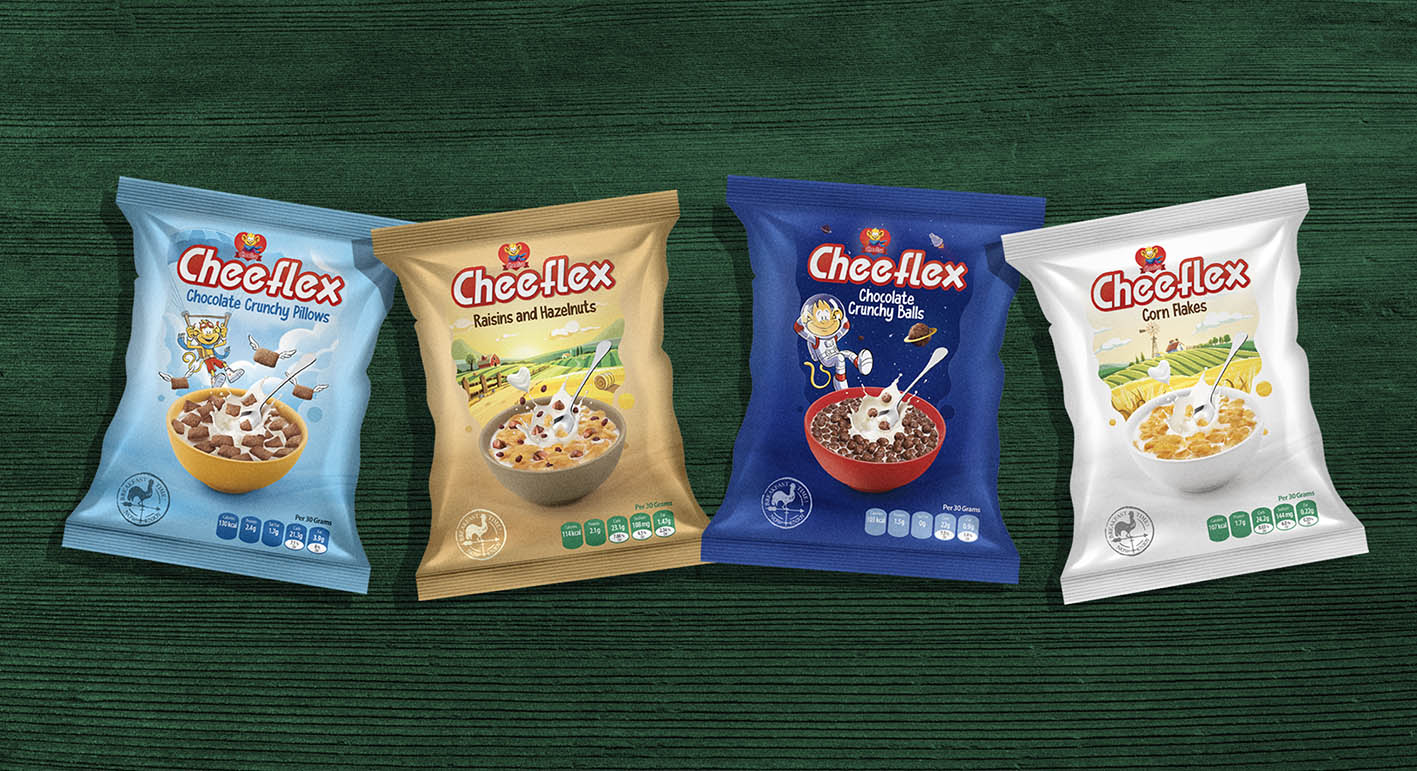
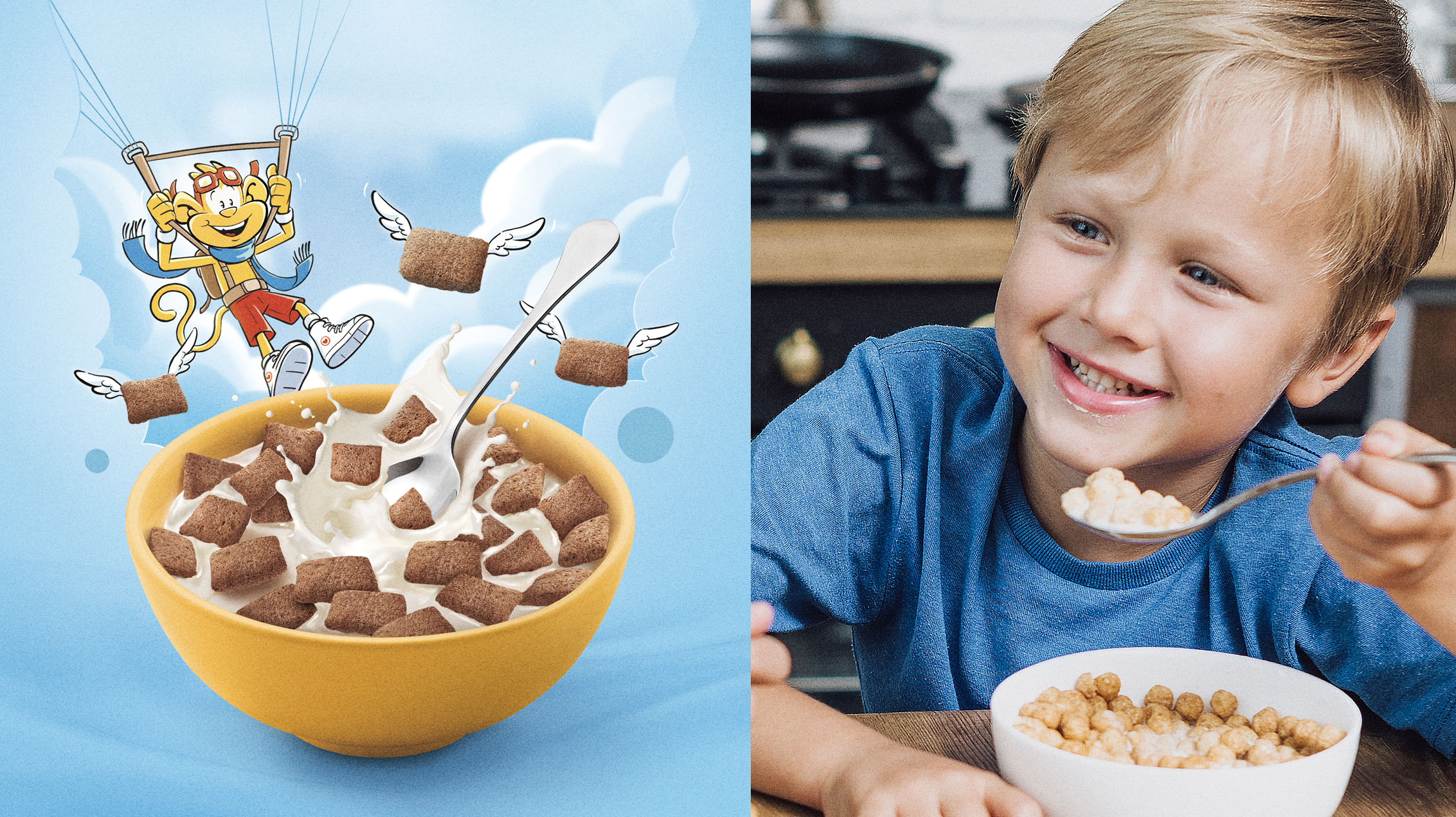
Cheeflex is a renowned cereal brand that prides itself on crafting a wide range of cereals, each boasting its own distinctive and tantalizing flavor. One of the brand's standout features is its captivating fantasy character, which adds an extra touch of whimsy to the overall experience.
With the goal of effectively conveying the delicious taste of each cereal variant, Cheeflex places great importance on their packaging design.
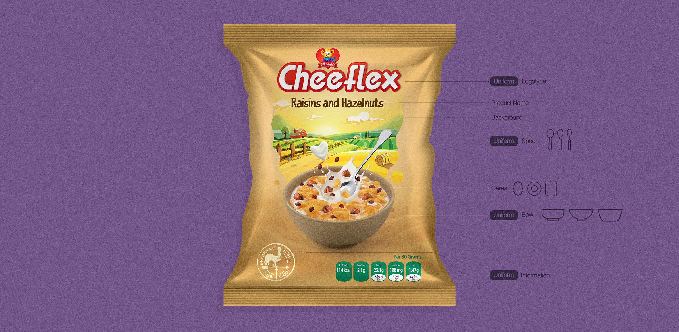
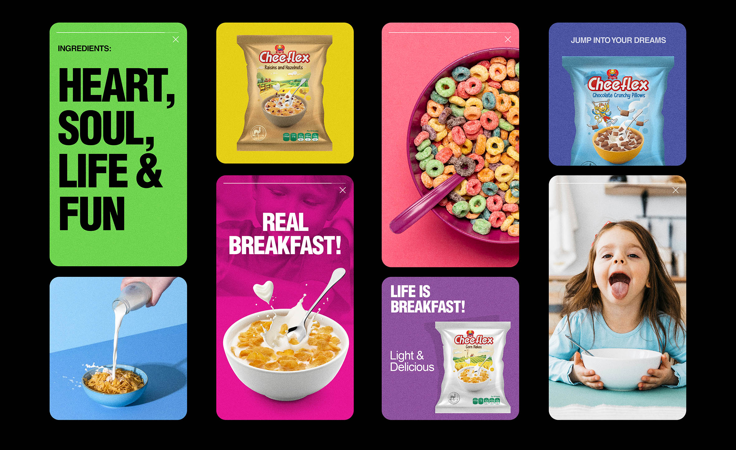
The concept revolves around bringing the taste experience to life and establishing a strong visual connection between the product and its character representation. Through carefully crafted packaging, every cereal variant receives its own unique design that seamlessly blends with the overarching brand identity.
Utilizing vibrant colors, playful illustrations, and mouthwatering imagery, the packaging succeeds in not only conveying the delicious flavors but also generating a genuine sense of excitement and anticipation among consumers.
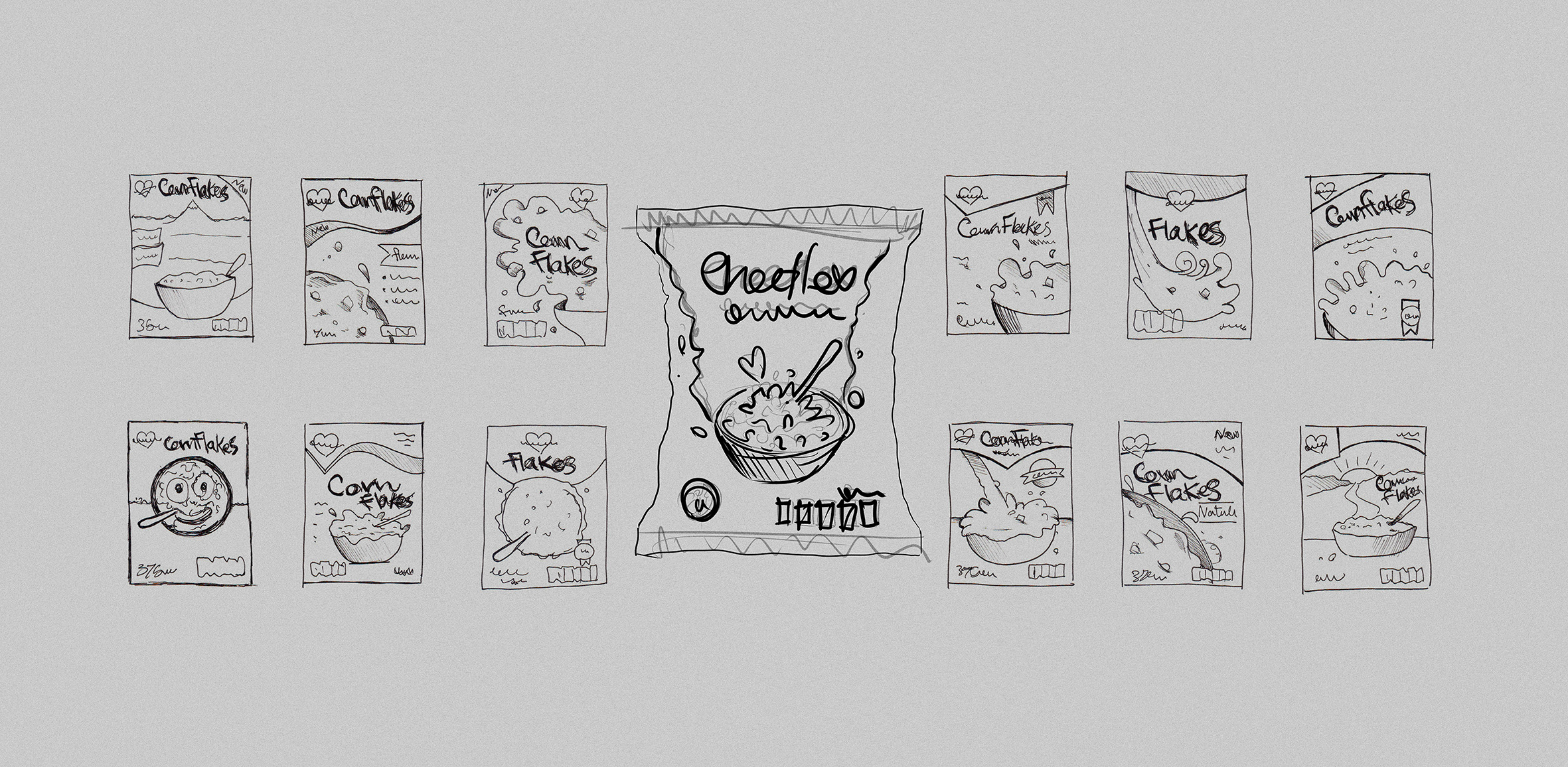
To bring this idea to life, I began by exploring various layout possibilities and composition styles through a series of sketches. These rough concepts allowed me to experiment with different visual directions and effectively capture the mood, energy, and narrative of each cereal type. The sketches helped shape the final designs by translating imaginative ideas into structured visual language, laying the groundwork for a cohesive and engaging packaging system.